A smoother path to posting pictures from phone to site
An experiment triggered by Dries’s blog post To PESOS or to POSSE? and my comment there about the friction in the UI’s for the POSSE approach. The Drupal content creation UI is not as optimized as the ones in native, mobile apps for Twitter, Instagram and the like.
I was curious how far I could take things just by stripping down the default Drupal content creation UI, optimizing it for posting an image + caption as an entry to this here blog.
What I did:
- Create a custom, stripped down content creation form
- Use evil CSS to hide superfluous items
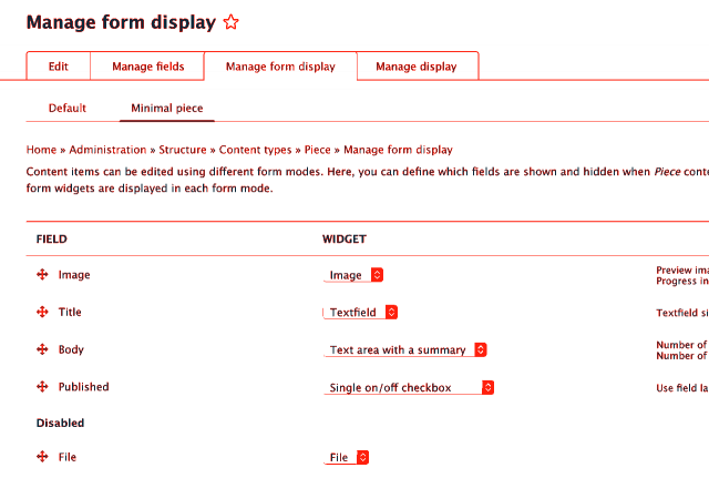
Custom form mode
The first step was to remove most of the fields that are not required to create a post. The Form Mode Manager module lets you do just that. I set up a “Minimal piece” form mode which hides the fields for inputs like a separate summary, tags, file attachments, url alias, author, date, sticky and the “promoted” checkbox. These are optional (not required) fields that can be left empty or provide sensible defaults (me as the author, use “now” for the publishing date).
This alternative form comes with its own URL I can go to to create that new post.
Evil CSS
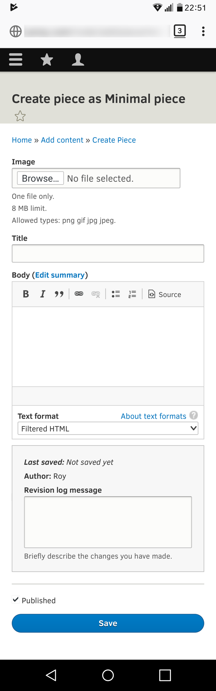
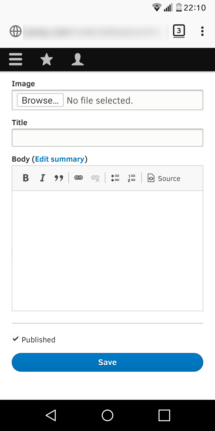
The stripped down form still shows bits and pieces I don’t really need to be reminded of every time I go to post something. Nothing a few display: none; CSS staments couldn’t fix. But, I’m using the default Seven admin theme here, which does not provide a body class to uniquely identify a specific page. I couldn’t add my CSS hacks to that theme’s (or sub theme’s) stylesheet because those would then apply to all admin pages.
I use the Firefox browser on my Android phone. Stylish to the rescue. We’re definately in proof-of-concept territory now! Stylish lets you define custom styling for all sites, a site or one or more specific URLs. I made one specifically for the URL where the minimal entry form lives to clean up that screen even more: hiding the header, breadcrumbs, form field descriptions, etc.
And, does it work?
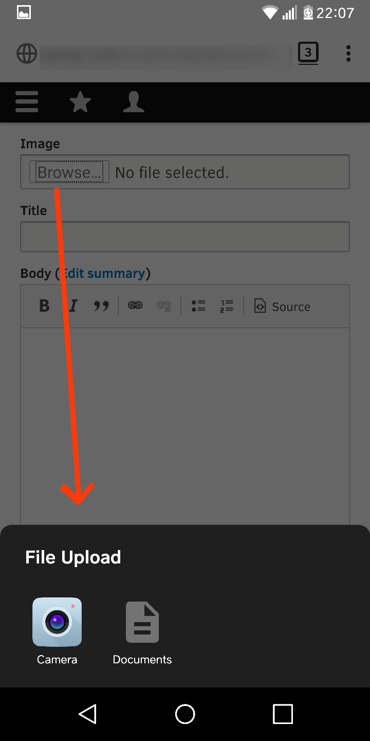
Yes. It’s far from elegant but it’s already a much more focussed and faster experience. I think I already knew but was happily surprised to see that the regular image field does provide access to both the camera (for taking a new picture) and the gallery (for choosing an existing image).
What could be next
One thing that makes the Drupal approach feel old school is the required title field. Twitter, Instagram, Tumblr all let you just type something into what basically amounts to a “body text” field. In Drupal it has to at least be just like email: a subject and a message: a title + a body. I can make the body optional but I want my text to go in there. Hiding the title field is not straightforward, I think because it is tightly coupled with the unique ID for that content item. There’s modules that let you hide the title input field but those still automatically generate a (gibberish) title.
Still, my focus was on smoothing the path for posting an image to my blog from my phone. That “Browse…” button is old school too, but it does provide access to camera and camera roll. Saving a bookmark for this comes with the option to create a shortcut icon for it on the phone home screen for quick access. Not bad for an hour or two of experimenting without coding :)
A couple of years ago swentel created Drupoid, an Android app that let you save an image from your phone as a content item on a Drupal site. It would be an interesting exercise to recreate something like it with React, Drupal’s (future) JavaScript toolkit of choice and figure out how smooth and snappy we can make it there.